Posters printed by Axelle Editions, Kayrock Screenprinting, Du-Good Press
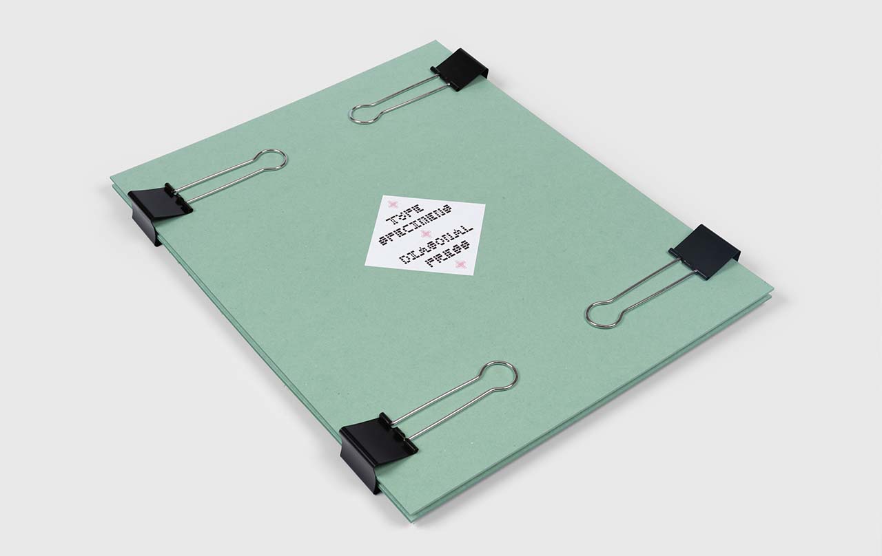
Portfolio cut by Talas
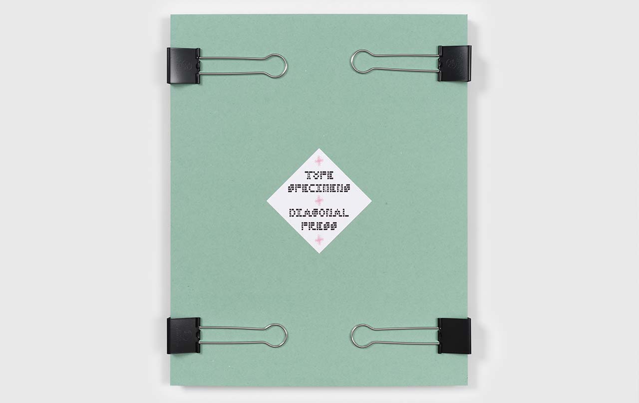
Labelled and assembled in-house
As a kid I would change the look of my handwriting periodically. I have a memory of being in third grade, writing an announcement in my journal that I would henceforth be making my lowercase “a” with a flat top. The resolution didn’t stick, but I continued to develop several different styles of handwriting, rotating between them according to mood or circumstance.
From the years 2001-2004 I worked as a sign painter at New Bohemia Signs in San Francisco. I had already learned a lot about letter structure from looking obsessively at graffiti — especially from Los Angeles, but this job taught me about strokes, kerning, brushwork and gilding. We did everything by hand. During those years my interest slowly drifted toward linguistics, semiotics and logic, but my love of typography and hand lettering has always remained.
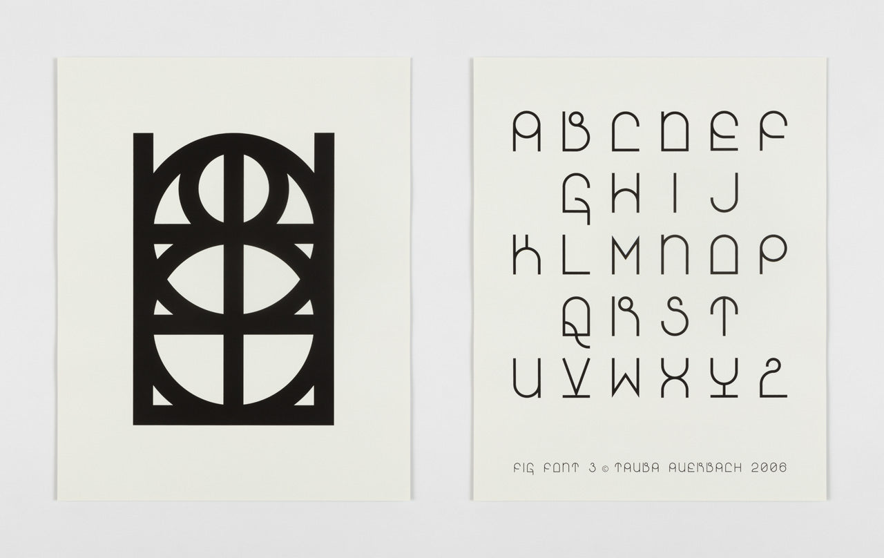
In 2006, I made Fig Font for the titles and headings in a book, and since then I haven’t been able to resist making new typefaces for every subsequent publication and my website. In 2007 I started a tradition of making calendars to give friends and colleagues as a New Years gift. The names of the months are always in a new face.
I've never sold fonts for use because the letters feel very personal — like visualizations of my voice. Seeing one of these typefaces used by a stranger would be akin to seeing my voice come out of someone else's mouth. I have occasionally loaned them to friends or created them specifically for use in album art, but it’s rare, and there is always a personal connection.
In this portfolio I present you with 20 of the existing faces. There will be more, and they will be printed in the same format so they can be added to the envelope.
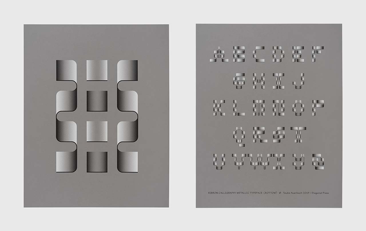
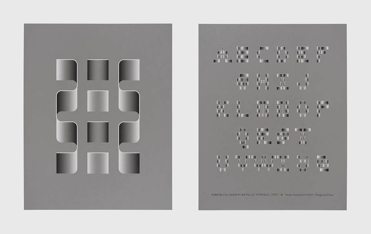
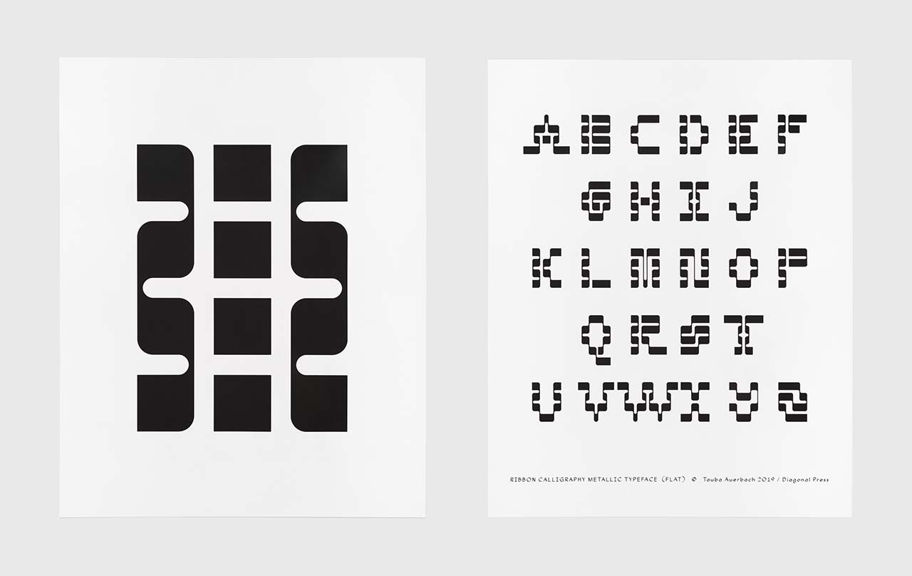
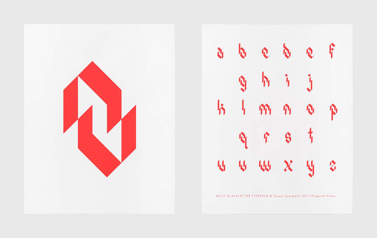
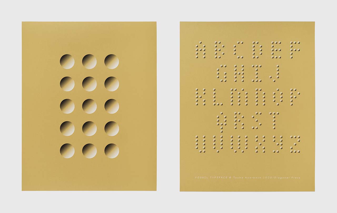
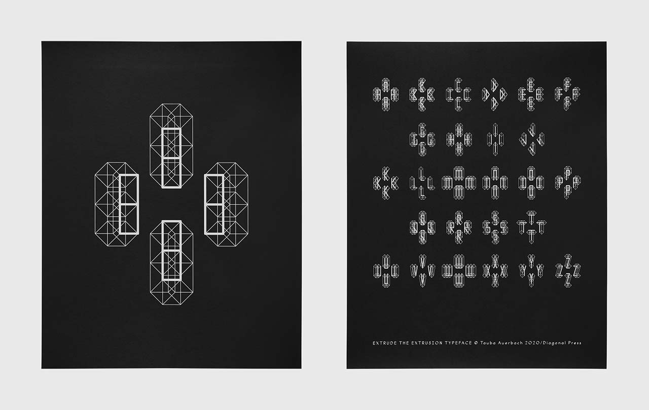
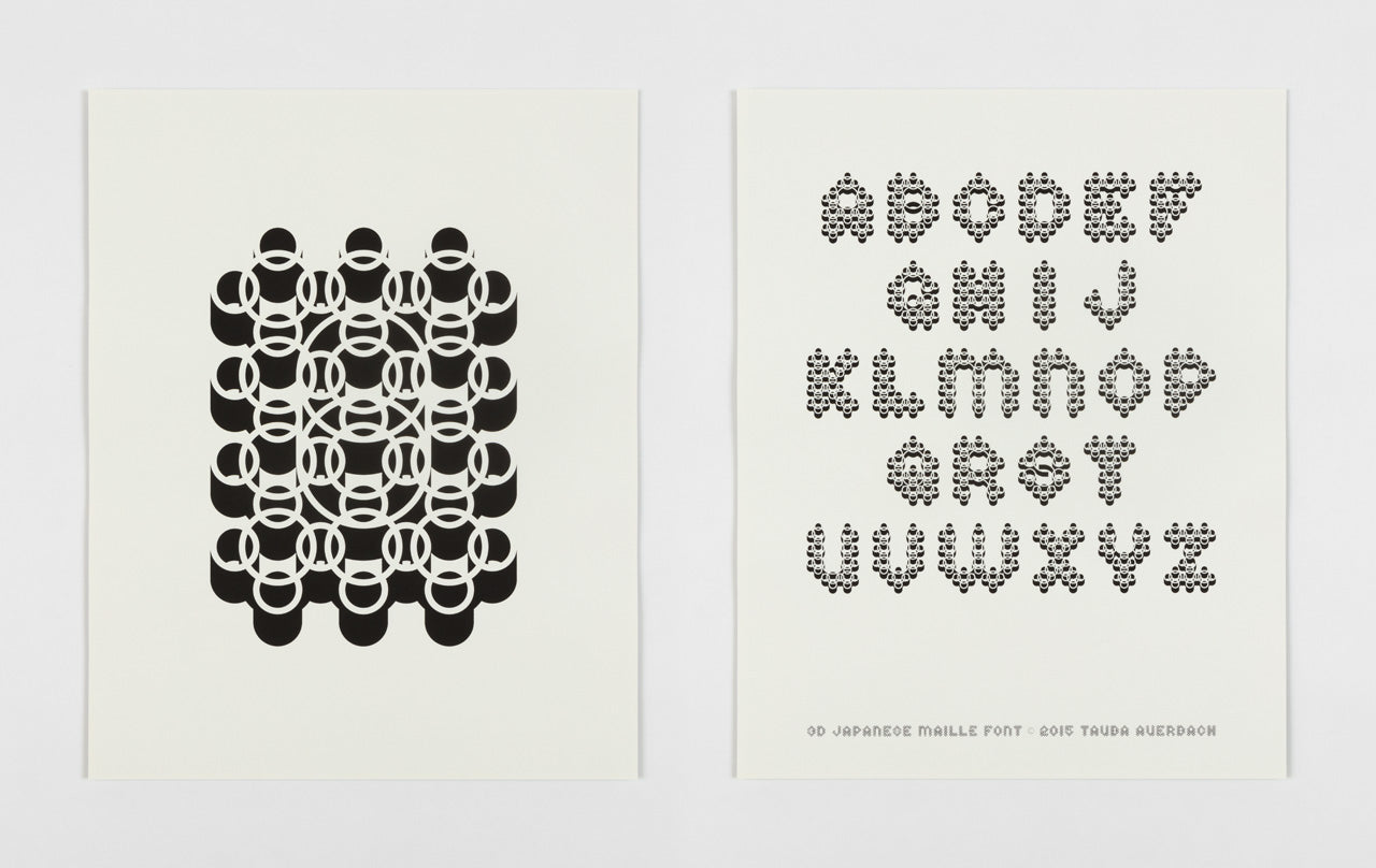
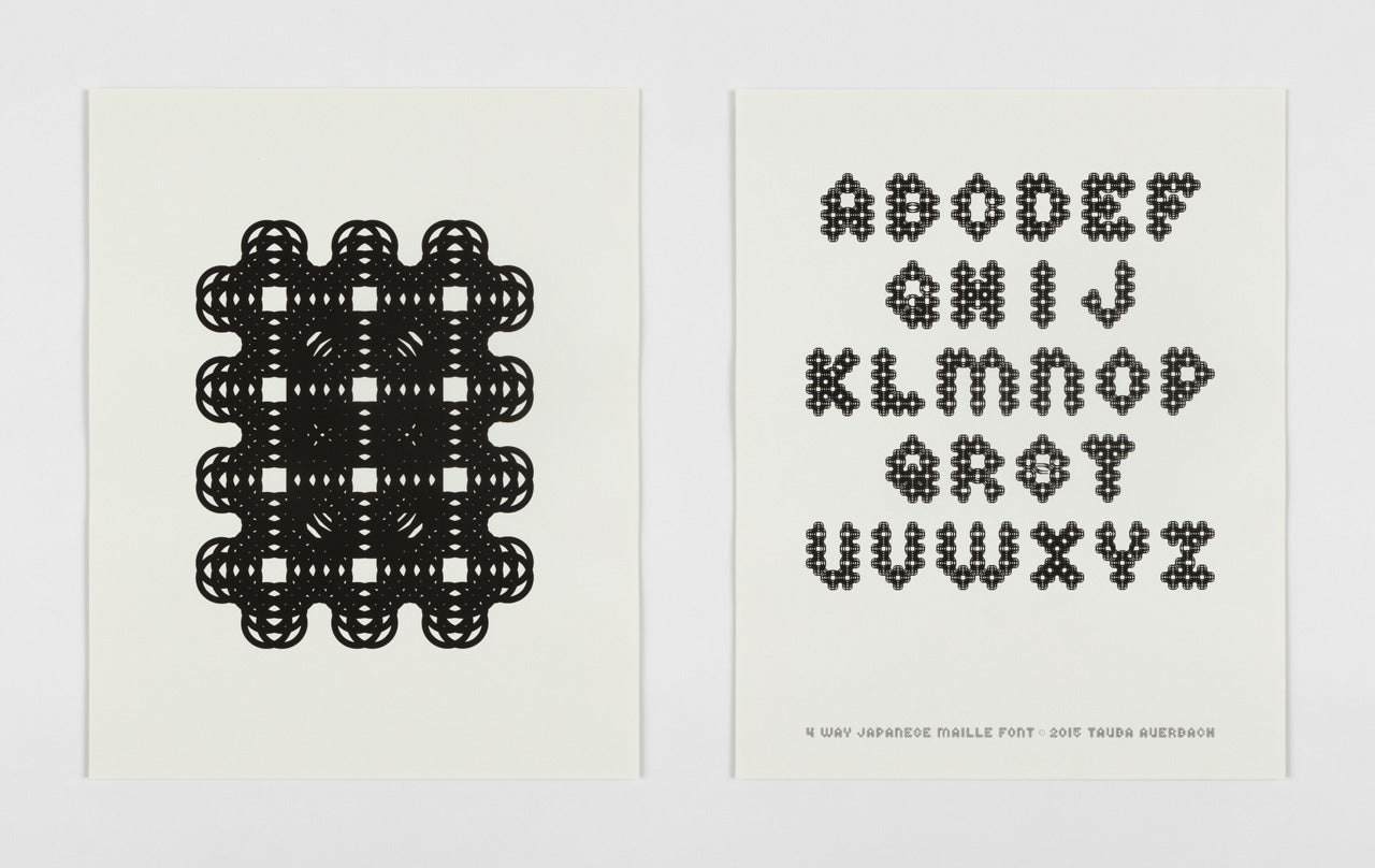
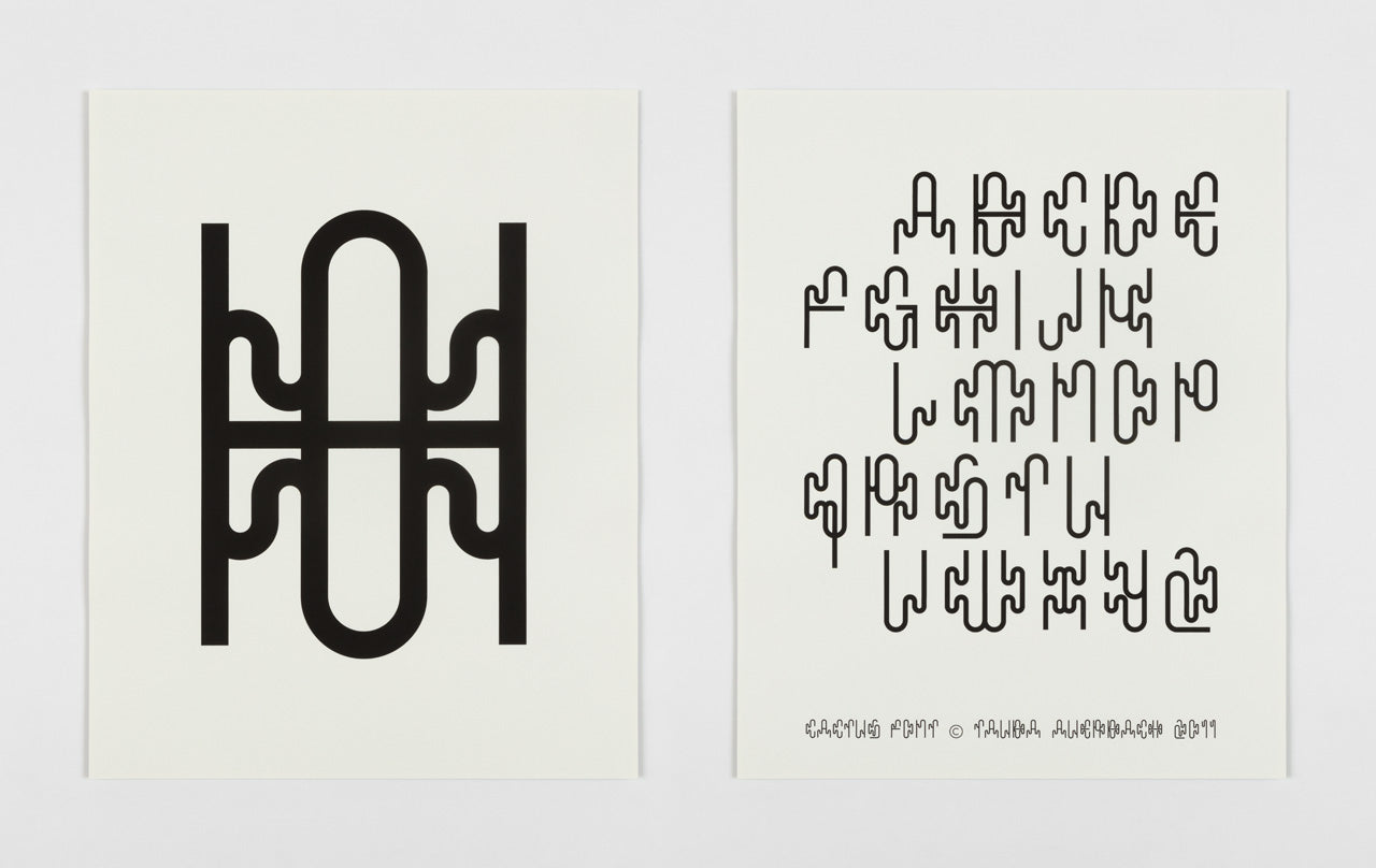
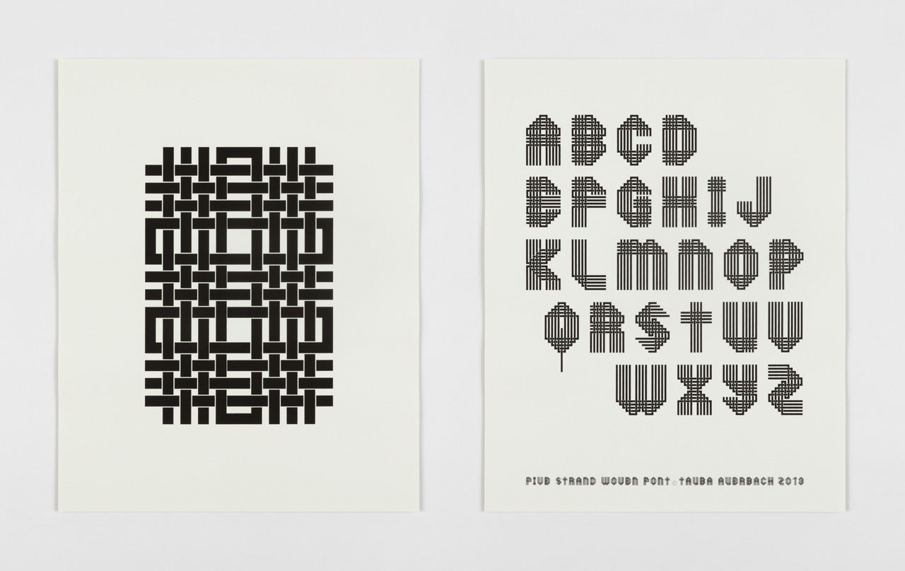
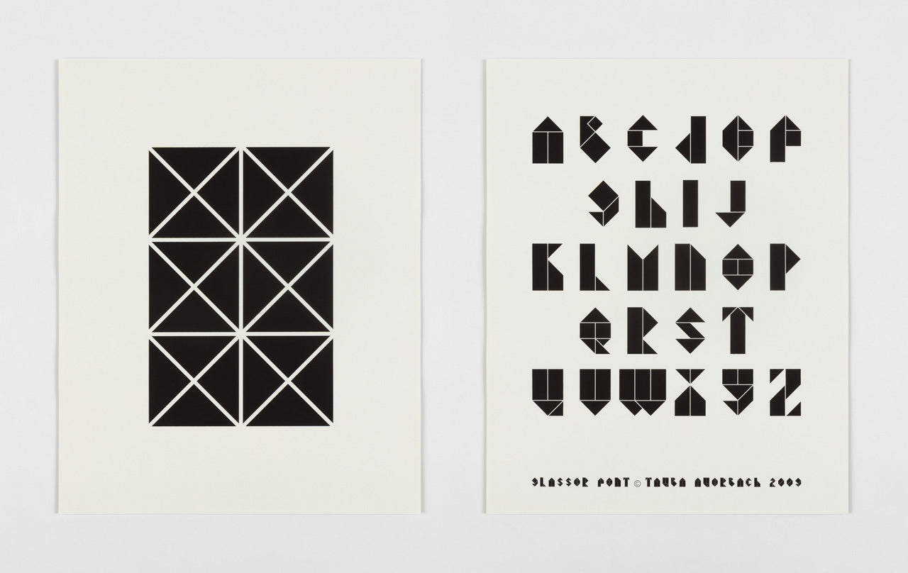
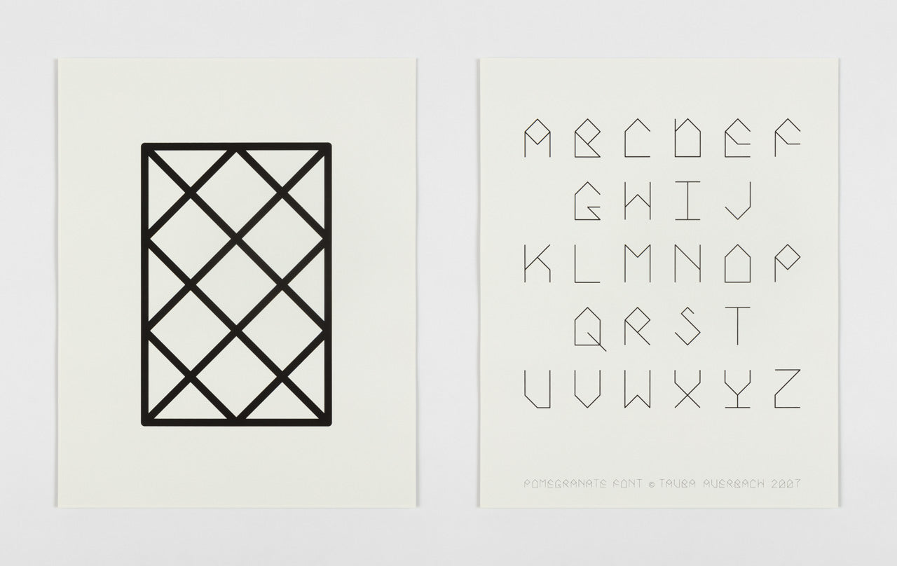
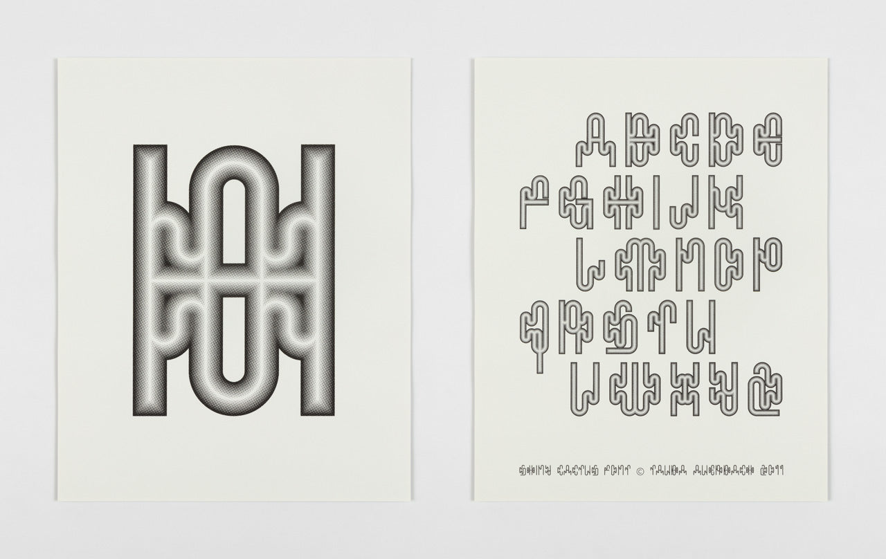
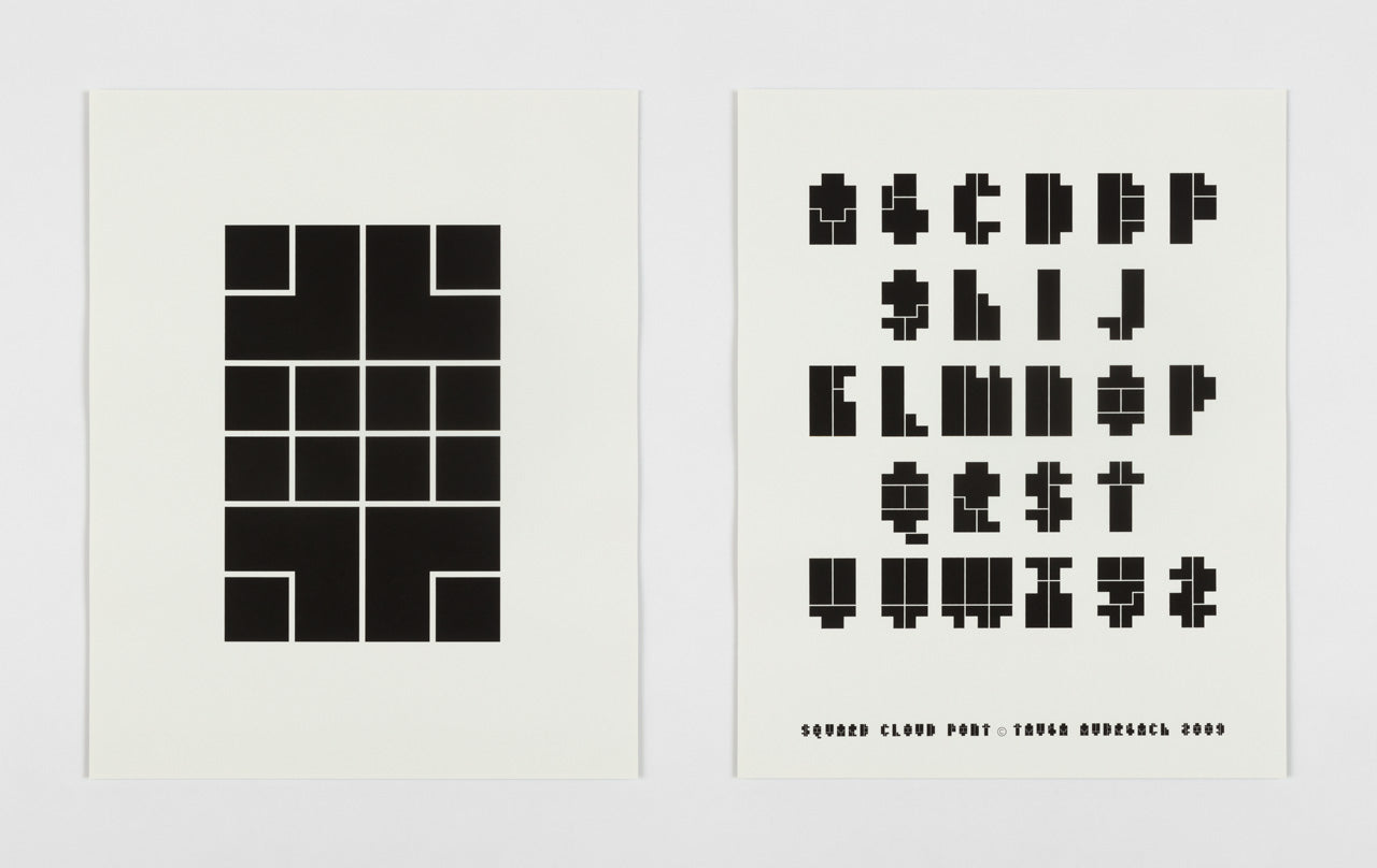
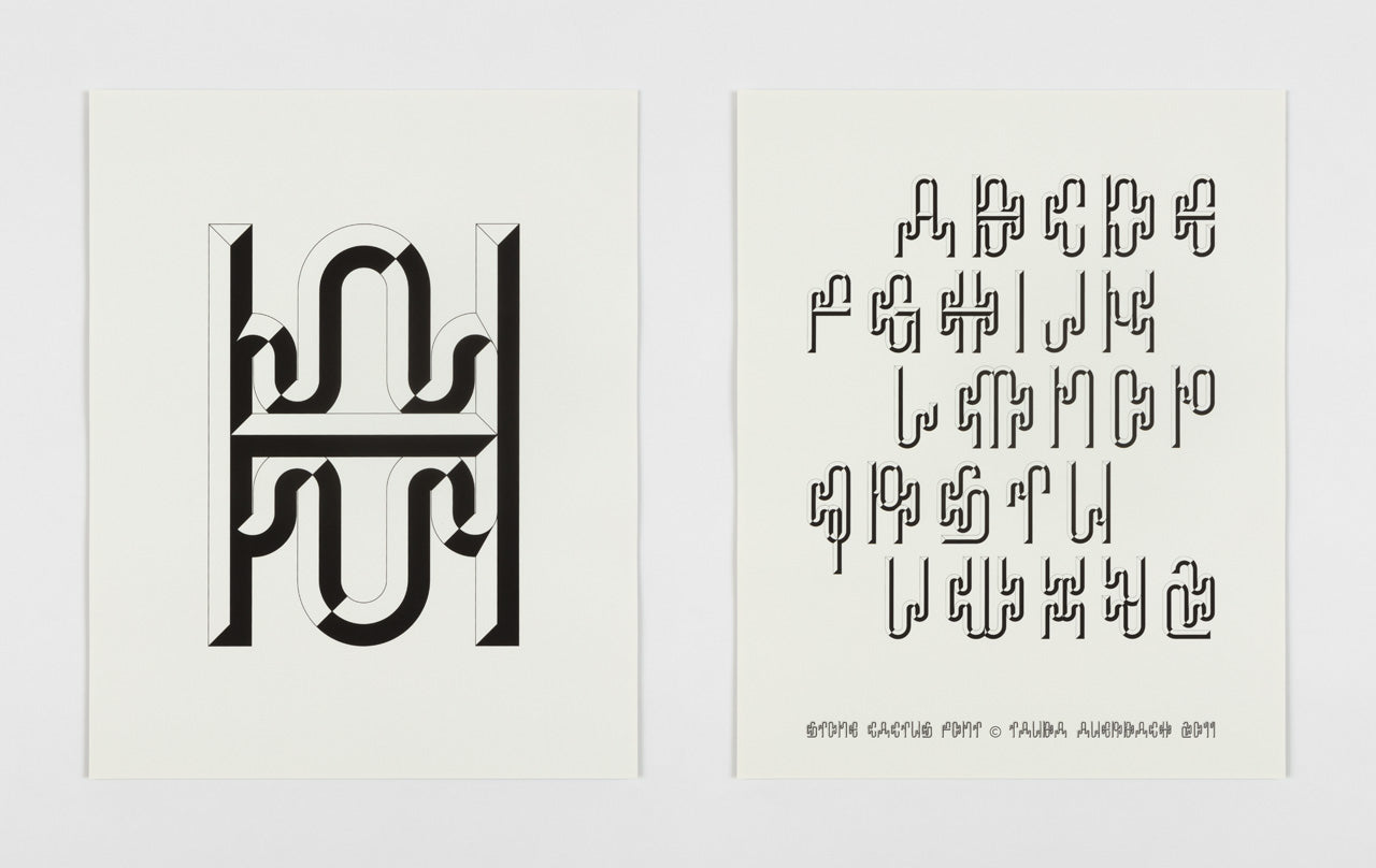
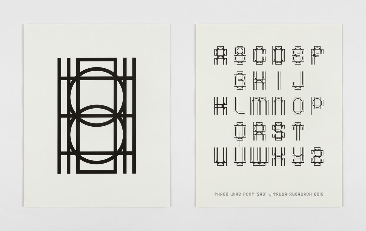
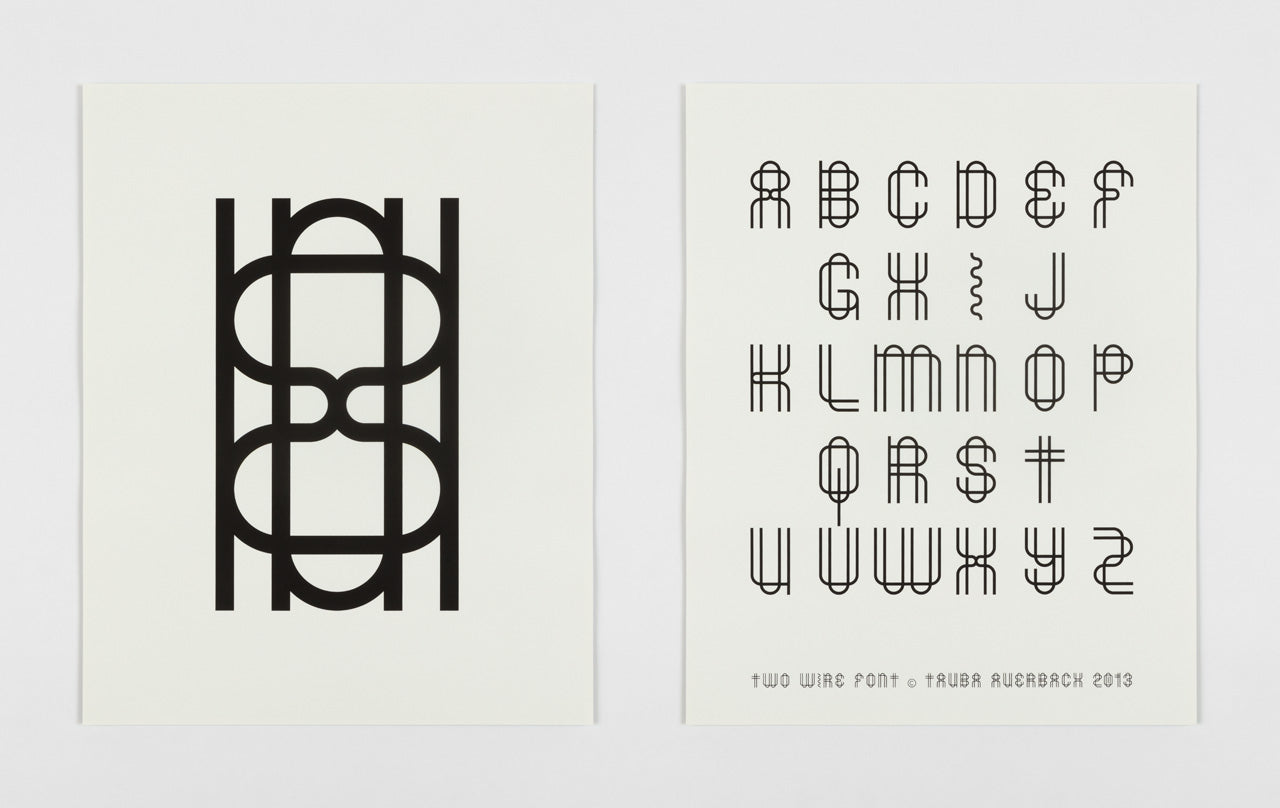
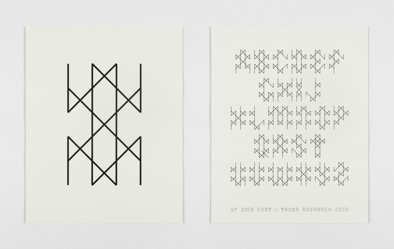
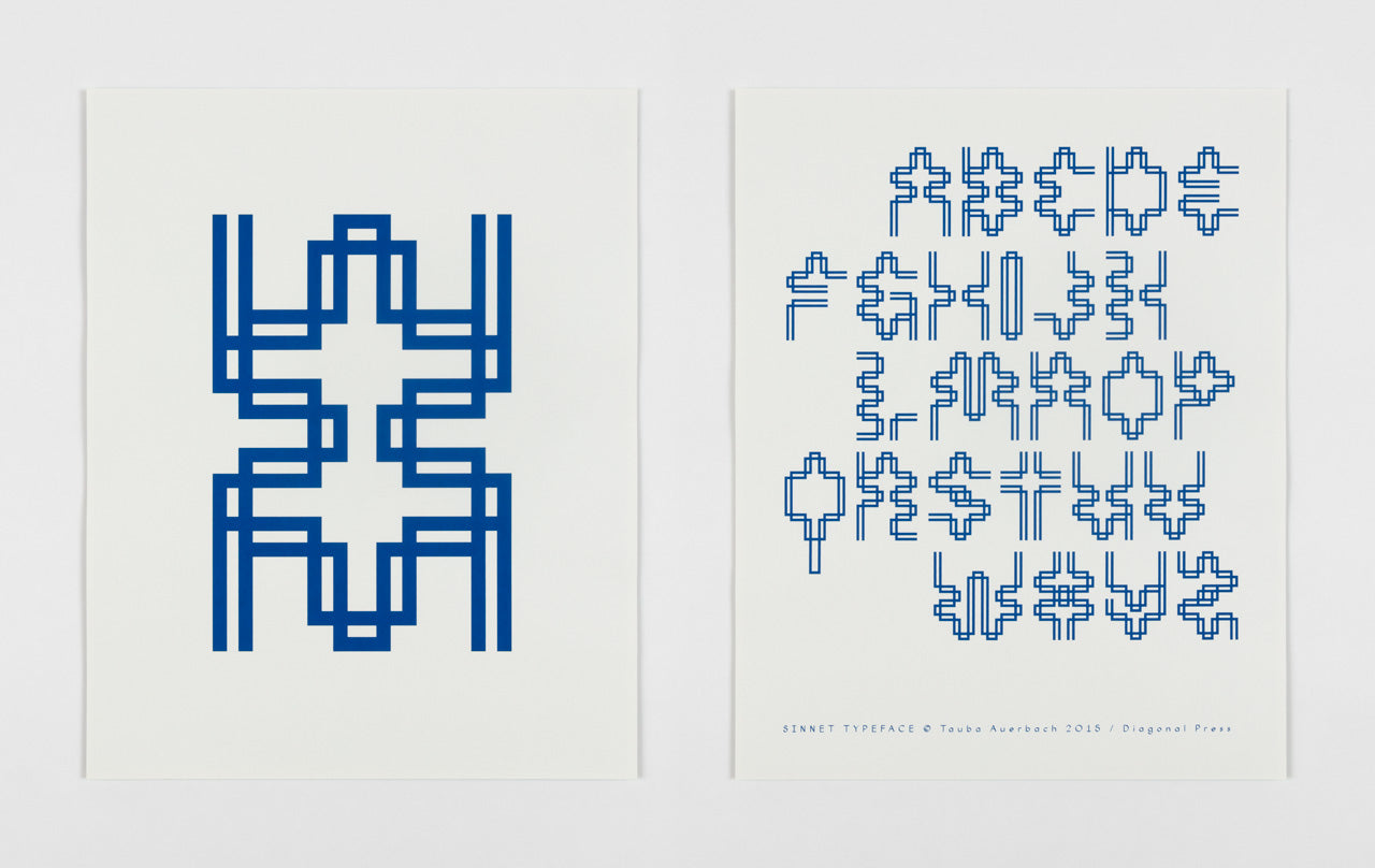
More than anything, this is a document of letter logic. Every typeface is built on a matrix of sorts — a system of components or shapes that combine in various ways to form each letter. Each poster shows the face’s matrix glyph (recto) and the resulting alphabet (verso).
All images and works copyright Diagonal Press.